Monday, 9 February 2015

Task 1

This task which i did was similar to the primary research task i did. For this task i had to go outside and shoot pictures relevant to the 6 elements of design . These were line, shape,form,texture,scale and lighting .

Below is a contact print of all the photos which i took for this task.Once i had done this, i had to choose 6 photos which i thought best represented the 6 elements.


                                                                           Form

This shot was taken at a high angle,which i want to re shoot because of the building which i think is too dark because of my camera setting i used. However, i like the way the face of the building looks biggest as it is nearer to the camera and because of the angle,and also i like the way the sky behind the building is brighter than the building itself. 


                                                                               Scale
In this shot i chose to shoot upwards at the building, standing at a low angle. 

                                                                          Shape
For this shot i chose to stand far away from the building as i was taking a shot for shape which is important that you show more than one side of a building so it looks 3D which the element 'shape' is all about.I think if i was to take this shot again, i would stand a bit further back so i can get more of the roof in the shot and not just half of it. 

         
                                                                            Light


                                    For this shot i chose to do a close up shot on a building which had light shining on it which i thought looked quite effective. Again for this shot i chose to capture the shot at a high angle where my camera was slightly tilted upwards .


                                                                                    Line


                                              I chose to take this photo at the angle i have taken it at because i thought it would look better rather than standing directly in front of it. I wanted to be able to capture the light shining on the building which i found defined the lines better. I like the way the building looks light because of the sun on it and the way the sky behind it looks like it is night time rather than day, because of the setting which made it look darker than it actually was. 

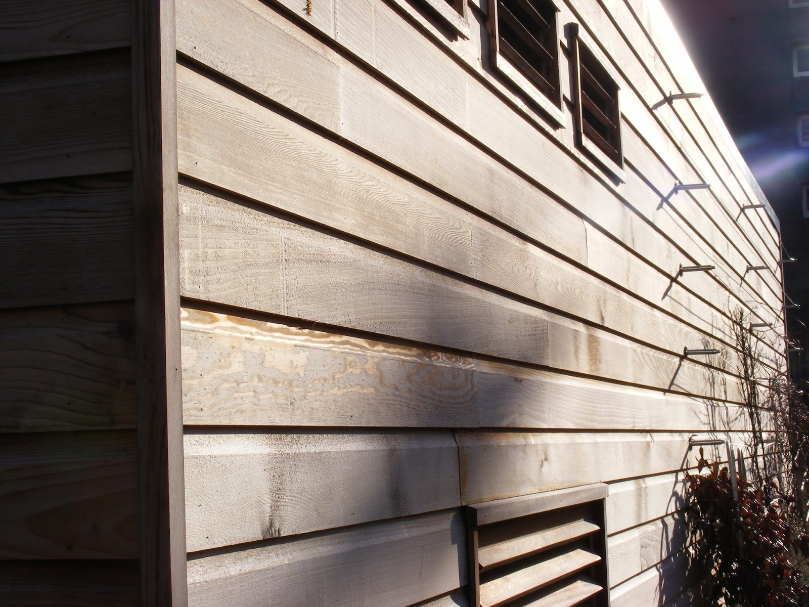
                                                                                Texture
For this shot i choose to take it at a high angle. I chose to use this photo for the element 'texture' as i liked the way there were all different colours and patterns which i think look like lego pieces which fit together to make a picture. 


Monday, 2 February 2015

Primary research

In this task we were told to work in groups of 4 which we then had to go out and photograph various things. These were; a building that was built in 1913 or earlier, building built in 2010 onwards, reflection,and a group member in front of a building i like.

Here are the photos which i took for this task in Bradford.

                                                                                Old


                                                                              Old

Out of these 2 photos of old buildings i had to choose 1 in which i wanted to use for one of my final images for my contact print along with another 3 photos.These 2 photos i took were of the same building however just at different points and angles. For the top image, i took this at a low angle and faces the camera upwards to shoot so in the picture you could see the scale of the building from where i was stood looking up at it.On this photo i like the way the pillar which is the closest object to the camera is darker in comparison to the building behind it which draws your attention to it first.
On the second image, i quite like the way i shot this as it is at a low angle however not pointing the camera directly upwards to the building. I wanted to shoot the side of the building which i did on an angle so a lot of the building was in the photo. I prefer the first image as i find it looks more historical and the daylight brings out the different shades of black on it. 


New

New


This is 2 shots of the same building, however at 2 slightly different angles. The first photo i took at a low angle and the sun which was shining on it took  away the colour a bit and also the setting of which i had on the camera when i took this shot also had an effect on the colour.In comparison to the second shot, i actually prefer the angle i took the second shot at as the first one has too much of the sky in i think. However, the second shot i took has lots of different shades of colour in because of the setting my camera was on, but i prefer the first shot as it looks more unique and interesting. 

                                                                       Reflection


Reflection


These 2 shoots are reflection which i found was the easiest shoots to do as there were lots of windows and doors which were easy to stand in front of with my group and capture a shot. I thought that it would be really difficult to capture a reflection in something, however it was easier than i thought as i managed to capture 2 shoots. I prefer the first photo as  it worked out better as the glass was slightly tinted so ther shot came out better, however the glass on the second shot was too light so it didn't turn out as well.